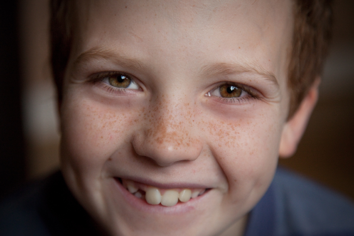
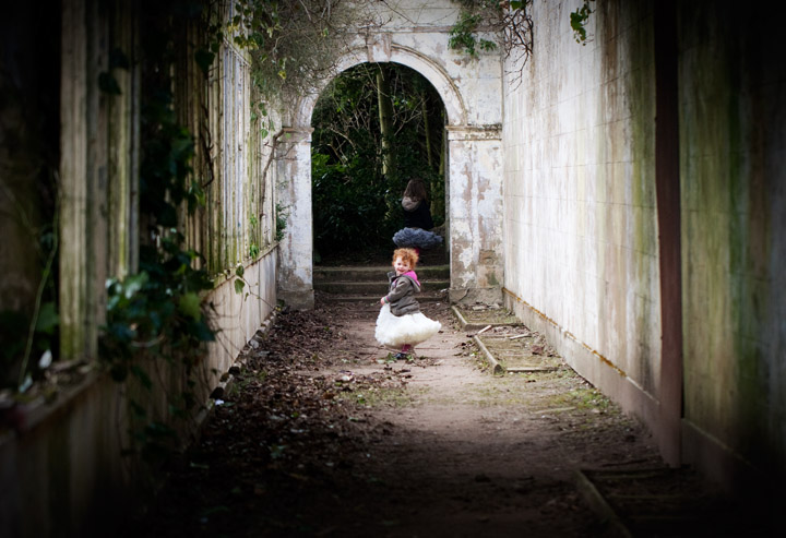
This week instead of covering another technical aspect of your camera I though i would focus on a more artistic look at how we can make our pictures look desirable to the human eye.
Just before i start actually though, thanks so much for all your lovely feedback about these posts. The biggest thrill i get is that people say they are going to go and have a go with their camera. That is my aim. Not to come across as a big know it all camera person. Because I am so not. But just to encourage parents to get out there and capture life as it happens in their families. Like the Fool did last week, experimenting with shutter. This week im re-naming my mamarazzi as dadrazzi in his honour 🙂
Anyway..so this week its all about composition. What is it that makes you look at an image and go WOW.
As photographer we can control what the viewer sees in our image. That can be by using things like shutter/aperture and manipulating the light..but also how we present the image is important. Where is the eye drawn to in an image? How is it all coming together.
Here are a few basic ‘rules’ you can follow.
Leading Lines
This principle is based on leading your viewers eye to what you want them to focus on by the use of lines in an image. They don’t need to be straight, just needs to be something that ‘lures’ the eye to the object of interest.
Here are some examples..
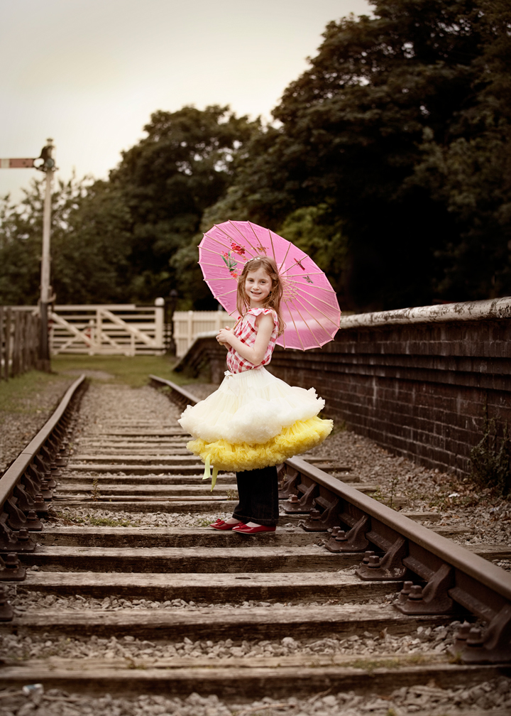
you can use so many different things as leading lines..here are some train tracks…
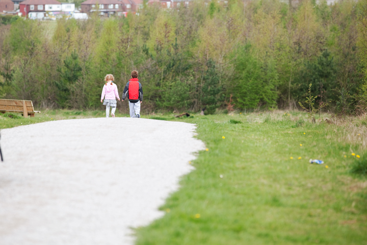 or something simple like a path
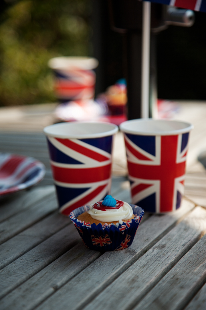
doesnt have to be just for kids either..you can use leading lines for anything you want to draw attention to.

fences are really good for leading lines, especially for portraits. get your subject to lean in to wall and then you do the same and shoot 😉

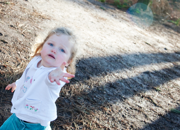
can even be something like a shadow
Frame it up
Im not talking about putting your picture in a frame on your mantel. Although we ALL probably need to do more of that and give our crippled hard drives a break from storing all those images that never get seen! But no what im talking about is using an element in your scence to provide a natural border that draws attention where you want it. You can use anything from the outline of a door or window to a row of trees of cluster of bushes. Basically anything that surrounds your subject will pack a punch.
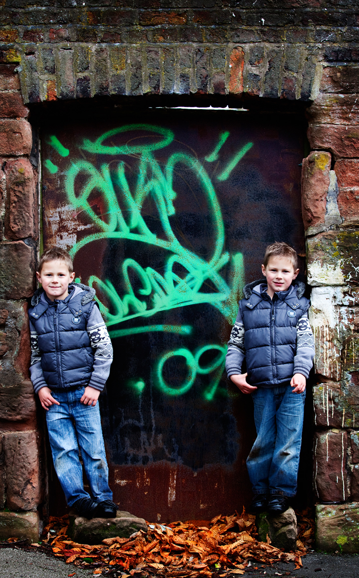


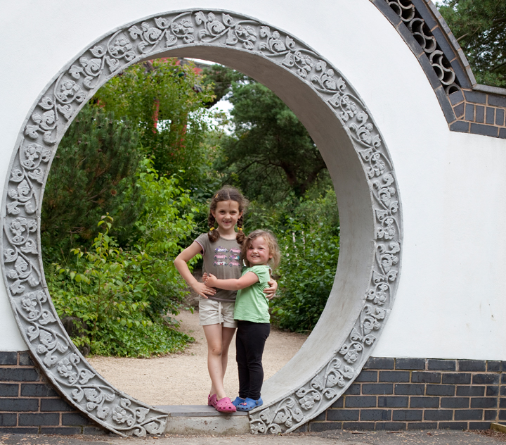
Look for negative
Not as in, think negatively, but as in think about the power of negative space in your image…nothingness. It really can pack a huge punch. It means an area of your image that has no visual content in it. Intentionally leaving some empty space around your subject can make a huge impact. Works well when following the rule of thirds…

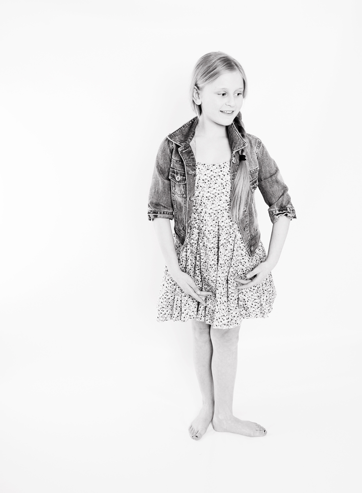



and lastly – for now…
Get off Kilter
So you think that you always have to have your subjects standing up straight and all your horizons level. Well sometimes its good to mix it up a bit and shoot on an angle. A tilted photo can add visual interest to your scene. The thing is to make your slant obviously intentional and not so awkward that your subject seems to be sliding out of the frame. Similarly, incorporating diagonal lines to your photo can aid the eye in moving across the image, giving your image energy.
Here are some examples..
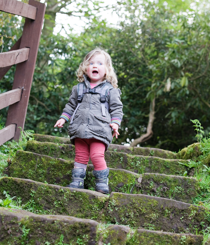

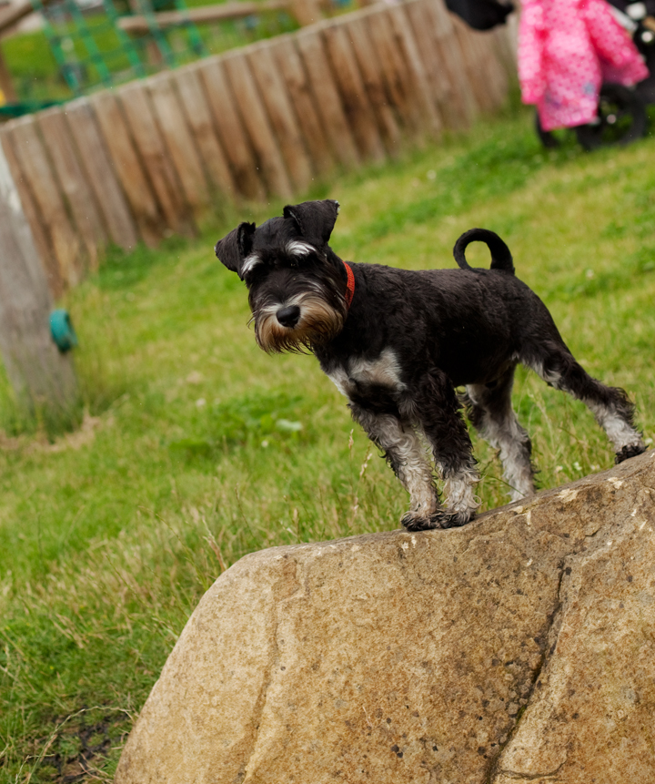


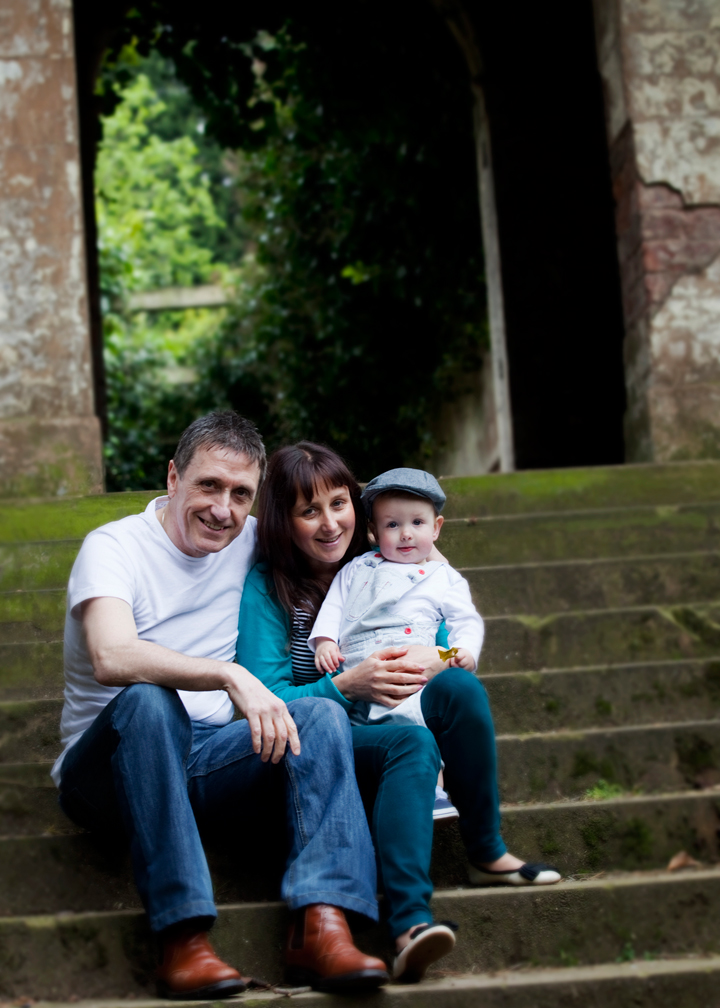
So there are a few pointers, see what you think and if you fancy giving it a go, do let me know how you get on.




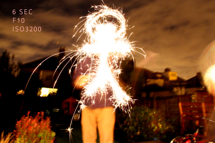 couldn’t do a post on shutter speeds without the firework one. I didnt have my camera on a tripod for this shot. I should have but what i did do was wedge myself against the doorframe for a bit more stability.